Most businesses don't have a content strategy. They have a list of blog topics someone thought of on a Tuesday, a sporadic posting schedule, and a vague hope that "more content" will eventually do something for the business. I understand why, building an actual strategy takes more upfront thought than just opening a blank document and writing. But it's also the single biggest difference between content that compounds over years and content that just accumulates. This guide is the framework I use myself when planning content for clients, stripped down to something any business owner can actually run with, even without a marketing team behind them.
A few years ago, " getting found online " basically meant one thing: SEO . Now I get asked, almost weekly, what GEO and AEO actually mean , whether they've replaced SEO , and whether a business needs to worry about all three or just pick one. Short answer: you need all three , and they're far more connected than the three separate acronyms make them look. This guide breaks down exactly what each one means, where they show up, how they overlap, and what actually changes about the way you write content once you understand the difference.
I've been writing SEO content professionally for the last few years, across property, trades, skincare, supplements, beauty and professional services, and if there's one thing client conversations have taught me, it's that almost everyone has heard the phrase " SEO content " and almost no one has actually been told what it involves. I've written elsewhere about why some SEO content earns its ranking and some doesn't , that piece is the philosophy. This guide is the practical follow-up: not why it matters, but exactly how to do it, the process I actually use, the structural and technical foundations underneath it, and the small, easy-to-miss details that turn that philosophy into a page that genuinely performs. If you take nothing else from this guide, take this: SEO content writing isn't a trick for outsmarting Google. It's about being genuinely, demonstrably useful to the person reading, in a format that happens to be exactly what search engines (and increasingly, AI tools) are designed to reward. Get that the right way round, and the rankings tend to follow rather than lead.

High CTR Hooks, Offer Clarity, Pain Points, Creative Testing and Prompts That Actually Work Here's the uncomfortable reality of running paid ads right now. Everyone has access to AI . Everyone is using it to write copy. And because everyone is using the same tools, trained on the same data, fed the same generic prompts — the ads flooding every feed are starting to sound identical. Same hooks. Same structure. Same 'Are you tired of [problem]? Introducing [solution].' Same energy. Same wallpaper. Which, if you think about it, is actually good news for anyone willing to put a bit more thought in. AI hasn't made great ad copy obsolete. It's made lazy ad copy invisible. The bar for stopping the scroll has gone up, not down — and the brands that understand that are cleaning up while everyone else wonders why their CPMs keep climbing and their CTRs keep sinking. This is about writing ad copy that cuts through. The hooks, the offer framing, the pain points, the testing frameworks, and how to use AI as a proper creative tool rather than a glorified copy-paste machine.

What Actually Brings Clicks, Leads, and Trust Most people treat SEO like a numbers game. Chase the keyword, hit the word count, grab the ranking, done. But here's the uncomfortable truth: a page can sit at position one and still fail completely. No clicks. No leads. No trust built. Just a metric that looks good in a report nobody reads twice. Real SEO content does three things at once — it earns the ranking, compels the click, and converts the reader into someone who actually does something. Getting all three right requires a different way of thinking about content from the very start. This is that guide.
You spend ages on your CV. You tidy the font, rewrite the bullet points, move sections around and try to make everything sound sharper. Then you apply for a role that looks right for you and hear absolutely nothing back. That silence can feel personal, but it is not always a sign that you are underqualified. Sometimes the issue is much simpler: your CV was not read properly by the system before a recruiter ever had the chance to look at it. Applicant Tracking Systems , usually shortened to ATS, are now part of normal online recruitment. They collect applications, extract candidate details, search for keywords and help employers shortlist faster. The important point is this: your CV now has two audiences. It has to be easy for software to scan, and it still has to sound clear, credible and human when a real person opens it. This guide walks through the practical bits that matter: layout, formatting, keywords, section headings and the simple checks you can run before sending your next application.
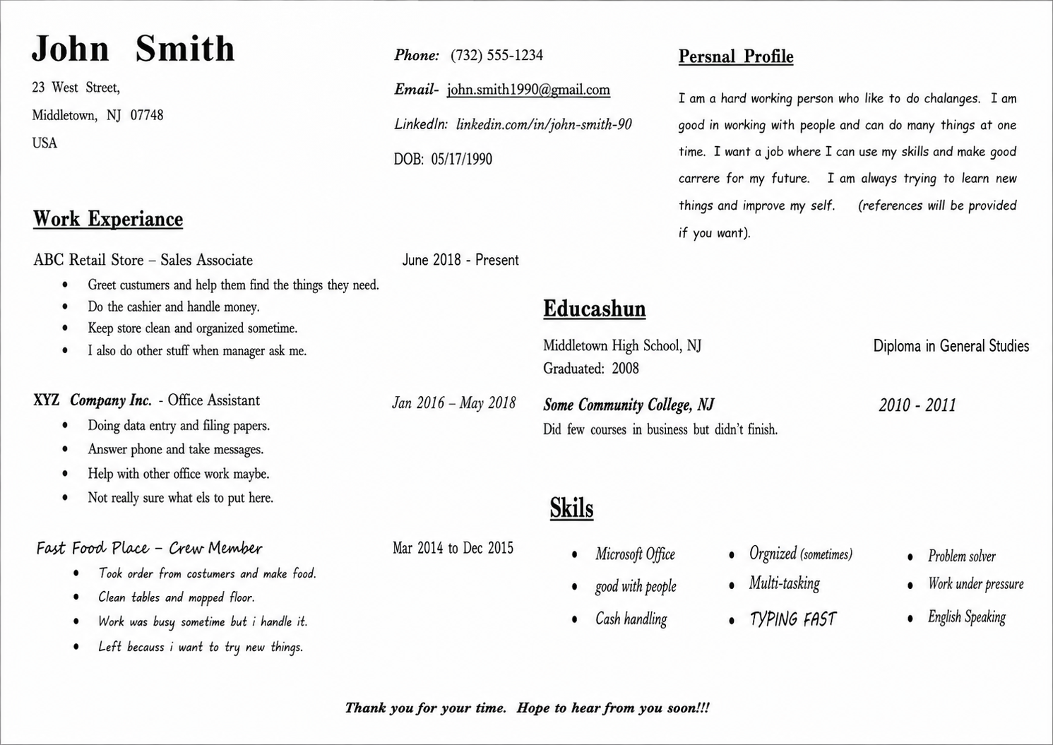
You've spent years building skills, climbing ladders, and collecting achievements. Then you condense it all into two pages — and hear nothing. That silence is the most common experience in modern job searching. According to Forbes, less than 3% of submitted CVs result in an interview. The problem, more often than not, isn't who you are. It's how your CV presents you. Here are 15 evidence-based fixes that make the difference.

Getting people to visit your website is only the first step. The real growth comes from what happens next: do they remember you, trust you, come back, sign up, enquire, buy, or recommend you? Website traffic is valuable, but repeat attention is more valuable . A visitor who returns three, four or five times is far more likely to become a customer than someone who lands once and disappears. That is why smart brands build systems to keep in touch with visitors after the first click.

Writing blog posts that increase site traffic is not about filling a page with keywords and hoping Google notices. Strong blog content works because it answers a real question, gives useful detail, and makes the reader want to stay, click, save, share, or enquire. Google describes good SEO as helping search engines understand your content while helping users decide whether they should visit your site. That means your blog post needs to serve both sides: the person reading it and the search engine trying to understand it.